The Monitor calibration and Gamma
assessment page
(If you already know all about gamma,
and just want to get on with the calibration; go here)
First of all, a quick word about gamma:
Basically, gamma is the relationship between
the brightness of a pixel as it appears on the screen, and the numerical
value of that pixel.
You probably already know that a pixel
can have any 'value' of Red, Green, and Blue between 0 and 255, and
you would therefore think that a pixel value of 127 would appear as half
of the maximum possible brightness, and that a value of 64 would represent
one-quarter brightness, and so on. Well, that's just not the case, I'm
afraid.
Cathode-ray tubes, such as the screen
you're probably reading this on at the moment, have a peculiar relationship
between the voltage applied to them, and the amount of light emitted. It
isn't linear, and in fact it follows what's called by mathematicians and
other geeks, a 'power law' (a number raised to a power). The numerical
value of that power is what we call the gamma of the monitor or
system.
Anyway, you can read up all about gamma
here,
if you're really interested. What really concerns us is applying some measure
of correction for this inbuilt non-linearity.
OK. Having established roughly what gamma is, why is it so
important to adjust it correctly?
An uncorrected monitor is perfectly adequate for a bit of word-processing,
reading e-mail, or even casual web browsing, but we're here to do some
much more serious and demanding work - image processing and editing.
Here's an example of the effect that a
change in gamma can have on the appearance of an image.
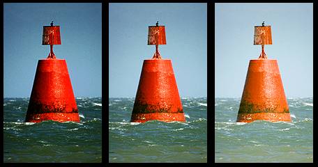
On the left is the image as it might appear on an un-corrected
monitor.
The centre image should look right on a monitor with a gamma
of around 1.8, and lastly;
the right-hand image is how a system with a linear response
[gamma of 1.0] might display the image.
By the way; if you prefer the right-hand image, your
first name's probably Timo. (in joke - sorry!)
Notice how the colour saturation and hue change with the gamma?
What this means is that if your monitor gamma isn't set correctly,
then you haven't a hope of seeing colours and tones the way that they'll
appear on other people's monitors; and they won't see your images the way
that you intended either. You might also have difficulty matching the output
of a printer to your monitor if your system gamma is set too dark, because -
You can't edit what you can't see!
Without any correction at all, most images
would be displayed far too dark, and no detail would be visible in the
shadow areas. At the same time, the highlight tones would be too widely separated.
Because we only have 255 brightness levels
to play with, it's important to get the distribution of these levels right.
That way the shadows don't get 'bunched up' and difficult to distinguish,
while we waste half of our precious levels defining unnoticeable increments of
tone in them.
Even under ideal and dimly lit viewing conditions,
an uncorrected monitor will make shadow detail difficult to see, and in a reasonably
well-lit room, other factors come into play which make the task of seeing the darker
parts of the image more difficult still. Our eyesight accommodates to the light,
making it harder to see darker detail, and more light is reflected from the screen,
further reducing image contrast.
Partial Gamma correction of the system
opens out the shadows and midtones; making viewing them much easier.
I say partial correction, because a totally
linear response is undesirable for reasons of colour accuracy and plain
eyestrain, apart from other good technical reasons.
So; what gamma value should you aim for?
My personal preference is to set a system
gamma of 1.8, even though I use a PC.
I'll explain why I made this decision, and you
can choose to agree or ignore me, as you wish.
Reason 1, and most fundamental, is that
a gamma of 2.2 is just too damned dark!
Reason 2. A gamma of 1.8 agrees fairly
well with the output of most printers.
Reason 3. The majority of graphics professionals
and pre-press proofing rooms use a gamma of 1.8, and who am I to argue?
Reason 4. Most monitors, graphics cards
and associated gamma correction software can easily cope with a gamma of 1.8.
(Try forcing a gamma of 1.0 on an old or cheap monitor, and you'll see why
it's wise to stay well within the
limitations of your hardware!)
Reason 5. If you go much lighter than
1.8, then you run the risk of highlight detail becoming difficult to distinguish,
and
of colour matching problems.
Reason 6. It gives Mac users one
less excuse to sneer, and they do enough unwarranted sneering as it is.
It's pretty obvious that my recommendation
is to aim for a gamma value of 1.8, but you may equally want to stick to
the sRGB / PC standard of 2.2, or compromise between the Mac and PC with
a value of 2.0, or something else entirely.
A compromise value of 2.0, midway between the
Mac and the PC, is probably a good choice if you're preparing images solely
for web publishing.
Anyway, it's your choice, and if you find
it's not working out, you can always recalibrate, or revert to your previous
gamma setting.
Calibration time!
Of course, you need some way of adjusting the gamma of your monitor
before you can proceed, and there are several ways of doing this.
If you have a full version of Photoshop from version 3 onwards,
it comes with a little utility called 'Adobe Gamma'.
You can use it in conjunction with my adjusment squares, and just ignore
the imprecise Adobe test patterns. In particular, Adobe's instructions for
setting the brightness level lead to a very poorly defined black level.
One good feature that Adobe gamma does have, is the ability to save settings,
allowing you to quickly switch between gamma values, colour temperatures,
etc.
If you don't have the Adobe gamma applet, then many graphics
cards have the facility in their driver sofware for adjusting gamma. Cards
which have this feature are made by ATI, Matrox, 3dfx, Nvidia and quite
a few others.
Then there's always an independent little application called
Powerstrip,
which gives you the ability to alter the gamma and colour on a whole range
of graphics cards.
How to
use the "Gamagic" test patterns
Ensure that your monitor has been switched on for at least half
an hour to stabilise before you make any adjustments. Even the best monitors
are liable to drift slightly during their warm up period.
My unique 'Gamagic' colour test patterns are a very sensitive and
accurate way to set up the gamma of your system, even though using these patterns
is very easy.
You simply adjust the gamma setting until all the squares match up with their
backgrounds as closely as possible.
The gamma curve is checked at three intensities, and this shows up any incorrect
setting of the monitor's black level (brightness control).
If you can't get the darkest set of squares to display as neutral grey, then
you need to adjust the black level setting of your monitor.
The brightness control is the usual way of setting the black level,
but monitors vary considerably between makes and models.
"Your mileage may vary".
Best viewing method is to half-close your eyes and sit well back
from the screen to make the patterns a little blurry.
When the gamma is correct the patterns will blend to an almost uniform
grey.
Away from the target gamma the colour of the inner squares shift away
from neutral grey, assuming red/cyan, green/magenta, and blue/yellow hues.
This allows a very sensitive and accurate setting of the target gamma.
I've been able to differentiate changes of gamma as small as 0.05 using
these patterns.
Not bad for a purely visual system, even if I do say so myself.
Enjoy!
Please choose a target gamma from
the following list:
Gamma
1.4
Gamma
1.6
Gamma
1.8
Gamma
2.0
Gamma
2.2
Gamma
2.4
When you've finished, you may want to verify the gamma with an
independent 'second opinion'.
I recommend this ingenious
little applet from Hans Brettel, who seems to be one of the few
other people to realise that gamma should be assessed across a range of
brightnesses in order to be accurate.
Warning!
There are a number of gamma checkers and so-called 'calibration' patterns
out there on the web that will give an entirely false reading or setting of your system gamma.
They're all based on the same fallacy: That of using a dithered pattern which is too
small to properly represent the correct brightness value(s). (For the technically minded;
the problem is caused by the risetime of most monitor hardware not being sufficiently fast
to turn from full black to full white in the space of a single pixel, or even two, in some cases.)
Luckily, most of the purveyors of these misleading patterns also seem to think that a
gamma of 1 is a good idea too.
Couple this with the fact that their faulty gamma patterns always indicate a gamma that's darker
than intended, and to some extent, the two misconceptions cancel.
The end result is a gamma setting of anywhere between 1.2 and 1.8, depending on the quality of
your monitor hardware and the resolution it's set to.
Basically, if the dithering of a gamma pattern is too small to see, or appears to be made
up of any sort of checkerboard pattern, then be extremely suspicious, especially if coupled with
a recommendation to work at a gamma of 1.
I'm on a mission to stamp out these useless gamma checkers, and I'm prepared to
'name and shame' the worst offenders. Some of them are even incorporated in big-name software.
For a start, the 'monitor calibration' in JASC's PaintShop Pro uses these bogus
patterns, and closer to home, the gamma setup of Acer's Miraphoto has exactly the same fault.
You have been warned.
Return to the Miraphoto
user guide.
Return to the index page.