Including some useful
hints and tips
And, after you've grasped the basics, check out my Advanced Guide
"This thing cost me three'undred quid! You mean I've gotta learn how to use it as well?"
"This thing cost me three'undred quid! You mean I've gotta learn how to use it as well?"
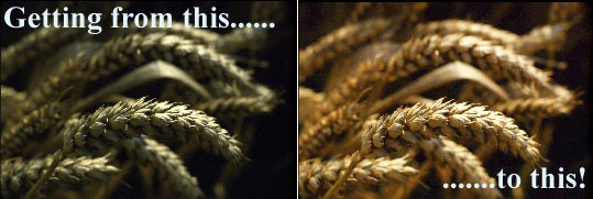
You've probably already viewed the sample scans
on the review page, and I think you'll agree that they're pretty good,
but how difficult is it to achieve results like that with the Scanwit?
The early releases of Miraphoto invariably rendered slides too dark at the
scanners default settings.
My answer has to be that, straight from the
box, Acer's scanner may not give you the best possible results; it needs
a bit of work to get decent results from it. Surprisingly, it's easier
to get acceptable results from negatives than from slides.
Now, Miraphoto Version 2 has gone a long way to remedying this situation,
and rendered these instructions somewhat redundant, but you may still find
the following techniques useful if you use one of the earlier versions.
It's also handy to know how to deal with slides which scan too dark, or with
a colour cast.
These instructions aren't meant to be a substitute for reading the manual that comes with the scanner; just some extra guidance that I think is sorely lacking in the makers documentation.
Getting it right, from the start
If you haven't already done so, calibrate
your display before you go any further. Most monitors can do with a bit
of help in showing correct colour and tonal range.
The little bit of time spent calibrating your
monitor now will make matching your printer to your screen easier, and
save you a lot of frustration, re-scanning and adjustment later on.
Check out your present monitor 'gamma' with my
my exclusive 'Gamagic' estimator,
or with this link to a clever Java applet
by Hans Brettel.
To use the estimator below, sit well back from your monitor and half close your
eyes.
Then look for the place where the squares lose their colour, and are most closely
matched to a neutral grey tone. The number beneath that section tells you the approximate
gamma of your monitor.
"A little free gif' for you"
If you've set up the gamma of your monitor correctly you should
be able to distinguish most of the steps of this greyscale from their respective
black or white backgrounds.
If not, it's back to the drawing board I'm afraid; or at least another
shot at setting up the gamma.
As a last resort, try winding the brightness setting of the monitor
up a bit, although you shouldn't have to.
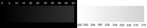
You can also download this GIF file by right clicking over it and
selecting "save image as....".
Then you can use it to check out your printer's ability to render
a full tonal range as well.
Setting up MiraPhoto:
Now, if you haven't used MiraPhoto before,
you must go through the MiraPhoto software with a fine-tooth comb and set
it up properly, dealing with scan area and resolution, scan mode and calibration.
From now on I'll abbreviate MiraPhoto to Mira for my convenience as much as yours.
You must have the scanner connected and switched on; Mira will not
open if it can't find the scanner. Insert the negative carrier into the
scanner as well. (The reason for specifying the negative carrier is that
it enables all six frames to be set up. At this point it doesn't matter
if you actually have any negatives in the carrier.)
Open up the image editor of your choice, select
Mira as the TWAIN source and open Mira.
I'd recommend initially setting the scan area
to full-frame, the resolution to 1350dpi, and the mode to high-speed for
each frame. This will enable you to quickly check your other settings without
waiting too long for each scan.
You do this by clicking on each of the small
preview frames in turn and then selecting the resolution and scan mode
from the drop down menus situated beneath the row of frames. After you've
done this, make sure the "Auto save config" option under the File menu
is ticked, then close Mira.
"Oh no, not gamma again!"
Your next task should be setting the monitor
gamma in Mira. Don't worry, this isn't the same thing as calibrating your
monitor all over again, what it actually does is calibrate the MiraPhoto
software to your monitor, and not vice versa. Doing this makes the preview
window in Mira more closely match your final scan.
Go to "setting" at the top left of Mira and
click on it. A drop down menu appears with "monitor gamma" as one of its
options. Click on this and the calibration box pops up. You might already
be familiar with this type of interface from setting up your system gamma
previously. Ticking the "sync" option locks the slider controls together.
Matching the rectangles won't necessarily get the preview looking
anything like the final scan!
Ignore the rectangular patterns, set all the sliders to 1.0 and close
the box.
If you later find that the preview doesn't match the scan, then readjust
the settings by comparing a scanned image directly with its preview. (The
effect of adjusting the sliders can be seen directly on the preview window.)
Having done all that, Mira should be set up
for your first scan.
Select the appropriate carrier and load it
with some slides or negatives. Make it easy on yourself, and choose
well exposed slides, or negatives with easily recognizable colours that
you know will print well.
The detailed procedures for slides and negatives
are quite different, so I've made separate sections for each.
The scanner's colour response is slightly
different for each of the various makes and types of film, so I recommend
you choose the type of film you most commonly use when initially setting
up the scanner.
Getting
started:
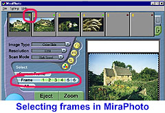
Insert the carrier and open up Mira from within
your image editor of choice. Select the frame(s) you want to scan by either
clicking the red/green dot at the top right of the frames in Mira (green
is selected; red is unselected) or highlighting the numbers in the little
frame-number bar.
Negative film users should skip to this link now.
Using Mira's curves tool:
I'll assume that what you've got from your scanner now is disappointingly
dark, and possibly with a colour cast.
"Lighten up, dude"
Let's deal with the density problem first.
You might be thinking that this is simply a case of adjusting the
overall brightness of the scan.... WRONG!
The brightness control is an almost useless function; in Mira or
any other image manipulation software.
All that increasing the brightness does is turn what should be black
to grey, and remove the detail from the brighter parts of the image. So
don't touch that dial.
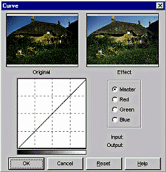
Here's what you actually have to do:
Bring up Mira's adjustment toolbar by clicking on the yellow button
with the red, green, and blue dot symbol on it.
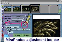
Now open up the "curves" tool by clicking on the little black and
white graph-like symbol in the vertical toolbar.
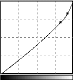
You should now be seeing a screen like this:
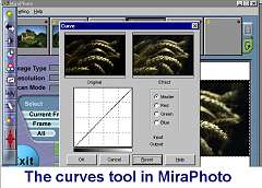
As you move the mouse cursor over the straight line graph, it should
change to a cross-hair sight. If you now press the left mouse button while
the cursor is on the line, you'll be able to drag it upwards into a curve.
Release the mouse button, and the line stays curved, but now it has a little
dot on it, and the image should look a little brighter. (see opening animation).
If you make a mistake you can put the cursor back over this dot
and shift it again, or even drag it off the end of the curve to get rid
of it altogether. You can repeat this procedure at multiple points on the
curve; re-arranging the shadow, middle, and highlight tones until the image
looks right. The graph is a bit small, and this makes accurate adjustment
a bit fiddly, but it gets easier with practise. If you make a complete
mess of it, you can always click "reset", and start again - no harm done.
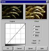
When you're finally satisfied with the look
of the preview, click the OK button to apply the correction.
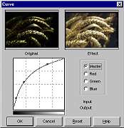
If you look at the bottom of Mira's toolbar
you'll see a funny little red symbol like a Zulu shield with four spears
sticking out of it. This is the "apply all" tool and clicking on this will
transfer the correction you've just made to all four slides. Do this now
if all your slides appear equally dark.
You're ready to do your first proper scan now. Check that just the frame you're interested in is selected for scanning, and click on "Scan". A progress bar will appear, and shortly after it reaches the end of its travel, the full-size image opens on screen, most likely hidden behind Mira. Move Mira's window to one side and compare the full scan with the preview in Mira. If there's a noticeable difference, you must adjust Mira's monitor gamma settings again, but this time use the sliders to match the preview as closely as possible to the scan proper. Now you can close Mira and admire your scanned image.
There are probably improvements still to be made before the scan
is finally to your satisfaction, but this should at least have got you
an acceptable scan, and any final tweaks can be done in Photoshop.
Once you get more confident and competent with Mira's curves tool, you'll
be able to get very decent images straight from the scanner. There's really
not much that you can't correct by manipulating the curves.
Scanning negatives:
In my experience with the Scanwit, negatives
don't give the same problem of over-dark scans as slides, but getting the
colour right can be a real headache. It's a lot easier if you've got a
good print as a reference, so I suggest for your first few scans you choose
some negatives where you've got some good prints to work to.
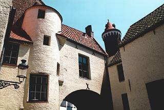
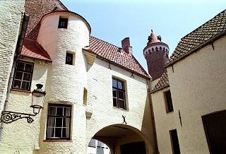
"A good reference eases you into the job"
Here's a flatbed scan of a print from the
negative that I'll be using as an example.
OK, you've got some nicely exposed negatives,
and decent prints from them to refer to.
Load up that negative carrier and let's get
scanning!
When loading the negative carrier, it's important to align the spaces between the frames with the dividers fairly accurately. Otherwise Mira's automatic assessment of the negative gets upset.
At this point I'll refer you back to "Getting started" to avoid repeating myself.
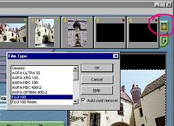
Now you'll need to select the most suitable film type from the menu, by clicking on the little film symbol at the right-hand side of Mira's screen.
Having got close to the right colour, open up Mira's curves tool to make finer adjustments to the density and colour of the image.
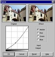
Please refer to the slides section for details on using the curves tool to correct colour casts.
Then when you're satisfied that the preview looks close to the reference print, click scan.
Finishing touches:
Scanned negatives sometimes don't quite have the "punch" that a
slide has, simply because they have an inherently lower contrast. This
low contrast can be an advantage, and enables negatives to cope with a
far wider subject brightness than slide film, but it usually means that
the colour saturation is a bit lower as well.
Photoshop can easily rectify this by boosting the saturation of
colours either individually, or altogether.
In our example, both the sky and the red roof are a little weak,
so we'll just give them some help.
Here's the Hue and Saturation interface in Photoshop:
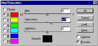
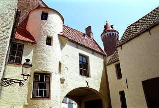
Perfect! (well, nearly). All of the tonal detail in the original
print has been retained, but the overall result is more vibrant, and much
closer to the sort of impact you get from a good slide. Altogether an improvement
on the flatbed scan from the print.
Despite these minor problems with negative film, I personally prefer it to slide film. Camera exposure isn't quite as critical for a start, and you get a much wider tonal range out of it, especially shadow detail. It can also be a bit more creative, in that you make the colour the way you visualised it when you took the picture, and don't slavishly follow the way that a slide film has rendered it. In fact, I think digital scanning has let colour negative film really come into its own, narrowing the ease-of-use and quality gap with slide film to a very close call.
So, as you see, there are no hard-and-fast rules to follow.
When it comes to scanning black&white negatives, you'll just have to
trust your own judgement. Play with the curves. The results are almost
instant, and it doesn't even cost you a sheet of printing paper. Be creative
and have fun!
It's just a pity that most inkjets make a poor job of printing black
and white.
"I'm no expert, but....."
I hope that what I've shown you here will be of some help in improving
your results from the scanner, and save you some of the frustration and
trial-and-error that I've experienced.
A little perseverance, and experimentation, will pay dividends in
the quality of your results and the ease with which you can achieve them.
How did defects in computer software and hardware
come to be called "issues" anyway? It's such an innocent sounding word.
Other goods would simply be called faulty or shoddy, and you'd be demanding
your money back. Maybe half the fun is outwitting the programmers
(not difficult) by finding workarounds for their crappy handiwork.
Anyway, enough of that. Here's a list of the
"issues" that I've found in MiraPhoto, and the solution, if any.
When is a RAW scan not a RAW scan?
Answer: when it's done with MiraPhoto.
The RAW mode should scan a slide or negative
exactly
as the scanner CCD sees it, but this doesn't necessarily happen in Mira:
The automatic black-point and white-point correction is turned off, but
none of the tools or filters are zeroed. Doh!!!
With difficult slides or negatives, it's sometimes
necessary to get them scanned into Photoshop before they've been messed
about with in any way, so that you can make your own decisions about white
and black points, gamma, etc. What you don't want is for filter, colour,
and density settings to be left active.
The only workaround is to painstakingly open all the tools and make sure they're reset before you attempt to do a raw scan. Then save that configuration as "Raw.cfg" or whatever, for future use (don't forget to click "Apply All" before you save it).
Incorrect file size
MiraPhoto version 1.009 (the first release)
reports the size of 36 bit scans incorrectly. It gives the 24 bit file
size regardless of what mode you're in. Version 1.10 was supposed to correct
this, but still managed to be a cock-up. It gives the 36 bit size all right,
but every application capable of bit depths greater than 24 works in 48
bit mode, so the file size is still out by a third. Are all programmers
complete idiots?
Workaround: You just have to multiply the
reported 36 bit file size by 2 (or one-and-a-third in version 1.1).
Automatic cast removel (sic) does not work
This function has no effect, whether the tick
box is checked or not. Version 1.10 corrects the spelling mistake, but
it still don't work, so whether it'd be of any use or not remains to be
seen.
No workaround.
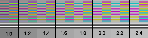
Monitor gamma setting is faulty
Matching the rectangles in the 'monitor gamma' setting
of Mira will almost invariably result in a mismatch between the preview window
and the actual scan.
In fact, the gamma should nearly always be set to 1.0 for correct
matching of the scan to its preview.
The default setting of 1.5 for monitor gamma in version 2 of Mira is totally ridiculous.
Workaround: Ignore the patterns, and set the gamma purely by matching a
preview to its final scan.
Auto buttons in brightness and contrast
tool always give overbright results
The 'Auto' option in the brightness and contrast
adjustment menu seems to always give ridiculously high brightness levels
for slides, and has almost no effect at all for negatives.
No workaround. They are useless functions
(all versions).
Symbols for RGB colour correction and Hue/Saturation
swapped over on toolbar
Not exactly a bug, but it annoys the hell
out of me.
And why didn't they make the Hue and Saturation
control work like the one in Photoshop? As it stands, this control is just
a fiddly duplication of the colour correction tool. Another waste of space!
And that stupid 36 bit mode nag screen in Version1.10. Aaaaargh!
Workaround: I have to chill out more.
Always make sure that your negatives or slides
are spotlessly clean before scanning. A little time spent cleaning your
film before it goes in the scanner will save you a lot of retouching work.
Negatives are more susceptible to dust than slides, since any dust shows
up as bright white spots on the scan. I recommend a rubber bulb type blower
to puff away any loose dust and lint. More stubborn dirt can often be removed
with a clean, dry cotton bud wiped gently across the film while it's still
in the carrier, followed up with another blast of air.
Minolta have a very good site devoted to the basics of scanning, and although it obviously has a slant towards their own scanners, much of it is applicable to the Scanwit and scanning in general. Minolta's How2scan pages.
I've just discovered Acer's Scanwit manual download
, in PDF (Acrobat) format.
It's in colour, and seems to be an improvement on the pitiful offering
that was provided with my scanner.
It's on Acer's Taiwanese site, and the connection can be rather
slow. Still, it's only 1.4Mb big, and I think you'll find it's worth the
download time.
Adobe's website contains a whole mine of information about many aspects of using Photoshop, and they also have an excellent tutorial on Colour Management.
|
|