
| This page is likely to be a
"work in progress" for the foreseeable future.
I'm constantly finding out more and more little kinks and quirks in the Scanner and its software. Sometimes they just turn out to be user error (oops!), so I don't rush to get them onto this page until I've checked my findings a few more times and convinced myself of their reality. I'm sure you'd rather I did this than publish misleading information. Please be patient. There are a few more sections in the pipeline, including a more thorough evaluation of Miraphoto v1.1, and the vexed question of film grain, but I'm only one person, doing this in my free time. Correction, make that what used to be my free time. |
Before you go any further, read this:
| This is supposed to be the advanced user's
guide, so I'm making the assumption that you've familiarized yourself with
the workings of MiraPhoto, and you know your way around the tools available
in Photoshop 5 LE.
If this isn't the case, I suggest you brush up on the basics before you read on. I've tried to make these advanced notes easy to follow, but in order to keep them fairly concise, I've assumed a bit of prior knowledge. Forgive me if I've assumed too much. I hope you'll also forgive the "sticky tape and string" approach to fixing most of the problems I've encountered with the scanner. ( I really don't have any ambitions to become a children's television presenter, honest.) |
Contents
|
|
|
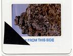 Cut
or tear a small triangle of the tape, and cover one corner of the slide
with it. If you're careful you can keep the tape from touching the actual
film by stretching it over the mount. Put the slide in the scanner
and scan it into Photoshop 5 LE with all of Mira's settings at default.
Then call up the Colour palette in Photoshop by selecting "Show color"
from the "Window" menu.
Cut
or tear a small triangle of the tape, and cover one corner of the slide
with it. If you're careful you can keep the tape from touching the actual
film by stretching it over the mount. Put the slide in the scanner
and scan it into Photoshop 5 LE with all of Mira's settings at default.
Then call up the Colour palette in Photoshop by selecting "Show color"
from the "Window" menu.
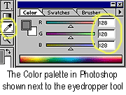
Now select the "eyedropper" in Photoshop, with the tools option
set to 3x3 averaging, and take readings from the obscured corner of the
slide.
Make a note of the red, green, and blue pixel values you're getting
from the taped area.
You need to know these numbers to properly zero the black level
of Miraphoto.
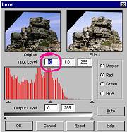 Open up Mira
and select the Levels or histogram option. Now click on "reset" to make
sure you're starting from scratch, and select the red, green, and blue
levels in turn.
Open up Mira
and select the Levels or histogram option. Now click on "reset" to make
sure you're starting from scratch, and select the red, green, and blue
levels in turn.
For each colour, enter the corresponding eyedropper values you took
in Photoshop into the top-left number box. (Or you can use the leftmost
arrowhead slider directly under the histogram chart, but I think the number
box is quicker).
When you've done that, click "Apply All", and save Mira's settings
as "blackpoint.cfg", so you can go back to this basic setting quickly in
future.
Now do another scan and check that the eyedropper readings are zero
in the taped over area. You might still get a reading of one, but don't
worry about that.
Taking eyedropper readings from the shadow area of the slide itself
should now show about 6 to 12. If that's the case, you've successfully
set the black point of the scanner correctly, and you'll see a decided
improvement in the neutrality of the colour, especially in the darker tones.
You can now use Mira's "curves" tool independently of the histogram function
to set up a standard configuration that gives good results with the majority
of slides.
A slight variation on the above procedure gives scans more suitable solely for viewing on a monitor, or wherever a bit of a threshold in the black level is desirable. This one requires a bit of mental arithmetic so be warned!
Instead of transferring the eyedropper numbers straight into Mira's
histograms, take the lowest pixel value of the three colours, and subtract
it from the other two. Then take the remaindered numbers and put those
into their respective histograms.
For example; say you get readings of 10 red, 16 green, and 14 blue.
The lowest value in this case is red (10). Take that 10 from the other
two values, leaving you 6 green, and 4 blue. Make those the green
and blue histogram threshold levels. Now, when you do another scan and
sample the black tape, you should have equal readings in each colour, (10,10,10
in our example) with the lowest values in the darkest areas of the slide
around 20. This method corrects the colour, but leaves a bit of slack to
overcome the monitor threshold, giving more transparent shadow detail on
screen.
Unfortunately, this black-point calibration is not a set-and-forget situation. The scanner will change its characteristics over time, and with temperature. It's advisable to check these settings frequently, especially if the scanner's used in an environment where the temperature can change by more than a few degrees.
I've owned this one for years, and whenever
I've used it, I've had remarkably consistent prints from commercial processors.
Whenever I've forgotten to use it, or couldn't
be bothered, the results have been.... well, let's be kind, and say "variable".
Coincidence? I don't think so.
It's not for your processor's convenience
anyway, it's for yours.
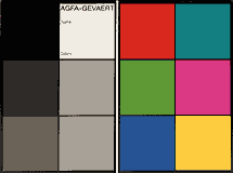
By scanning a test-card negative with every
roll of film, you'll have a much better idea of the sort of correction
that you need to make to the rest of the frames. In particular the hue
and saturation settings that are needed for the most accurate colour rendering.
The manufacturers of colour negative film rely
on the fact that their colour printing paper has complementary characteristics
to the film. In other words, deficiencies in the film image are made up
for in the paper.
Now, obviously, our scanner doesn't have the
characteristics of colour photographic paper. (Massive contrast and non-linearity,
a favouring of certain colours, and an orange bias.) If it did, it would
be all but useless for scanning slides. So what we must do is make our
scanner behave like a colour negative paper.
Most of this is done automatically in the
scanner software, but for the best colour match there's always that little
bit extra that only human intervention can achieve. All of which brings
us back to our test card. If we've no frame of reference, the task of matching
a range of colours for hue and saturation is almost impossible; but by
checking our results on screen against our little portable colour card,
it's at least achievable, although it still might not be easy.
Incidentally, because our colour card is a low-contrast reflective
original, we should really compare it to a printed final image to
check our colour accuracy. Comparing it to a monitor image may be slightly
misleading, even though it's a lot quicker.
| I can't, and won't, accept responsibility for any loss or damage that occurs to your system from following these instructions. If you're at all unsure about what you're doing: Please, don't do anything. |
Now that we're quite clear where we stand, and you undertake to accept full responsibility. Read on:
All you need to do is edit a file using nothing
more sophisticated that the "Notepad" application that comes with Windows.
But before you do anything else, make a backup copy of the file you're
about to edit. It's called "FilmType.ini", and it's usually located here: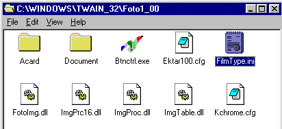
Alternatively; use the Windows search facility
to locate it.
First of all, start Notepad, and activate the file open menu, then, locate the TWAIN_32 directory in Windows, and open it.
Select "All files" in notepad's "Files of type:" menu.
Next, open up Mira's directory. This is called "Foto1_00" in version 1.009 of Mira.
In this directory you'll see a file called "FilmType.ini"; select it, and click "Open".
You should now be looking
at this: 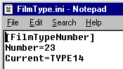
The line that says 'Number=23' will have to be altered first. Change it to read 'Number=24'. This will make Mira search for one additional film type.
Now scroll a bit further down the screen to this:
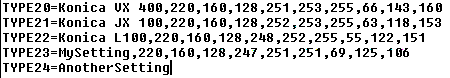
As you scroll down, you'll see that the next
block of information starts with 'TYPE0=Generic,...' Keep going until you
get to 'TYPE22=Konica....'
The original list stops at TYPE22, but you
can see that I've added another line 'TYPE23=MySetting, 220, ......etc.',
and I've started to add 'AnotherSetting' at TYPE24=.
Whatever you enter directly after TYPE(number)= will appear in the 'Film Type' menu box in Mira.
Like so: 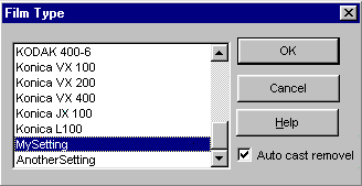
The numbers following the comma, after TYPE(number)=(film name),
are
absolutely essential. If they're missing, MiraPhoto will crash. There
must be 9 numbers separated by commas following the film name, and the
numbers must be within the range 0 to 255.
The first three numbers determine the white-point aim values, and
the lighter tones in the scan can be adjusted by altering these numbers.
They are probably specific to the individual scanner, and the values that
Acer have chosen are an average. My particular scanner gives more neutral
highlights by setting these numbers to 230, 135, and 90. This gets rid
of a slight blue tendency on my scanner, so you can see that quite drastic
changes in the numbers are needed to achieve a subtle result.
I have to admit that at this point in time I've no idea what the
other 6 numbers are supposed to do. I've tried changing them, and they
appear to have little or no effect on the resulting scan. I'll keep digging,
but at the moment I suggest you simply copy a row of numbers from any
of
the other film types.
The important settings that do make a drastic difference to the scan are yet further down the page. They are the numbers following the heading "Gamma(number)=........"
They look like this: 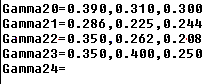
From left to right, the gamma settings are in Red, Green, Blue order,
separated by commas. They are decimal fractions between 0 and 1, where
zero is darkest (black in fact) and 1 is lightest. Settings between 0.300
and 0.450 seem average for Red, while the Green and Blue values vary around
the 0.250 to 0.350 mark. However, since you're probably trying to accommodate
films that don't have any suitable setting already, trying values outside
of this range won't do any harm.
My advice is to pick the existing film type that comes closest to
being right, and copy the film-type and gamma values for that, then work
from there. If the existing setting is too blue, for instance, reduce the
third value (which controls the blue gamma). If too green, reduce the middle
number, and so on.
If the scan looks too dark (unlikely), then increase all three settings
in proportion.
I hope you've got the idea by now.
Don't add any spaces, empty lines, or other punctuation to the file. Just add the additional lines and click on 'Save'.
!Remember to add another number to the 'Number=' pointer every time you add another custom film type!
Testing your new settings involves opening Mira and selecting your
new film from the menu box, then clicking 'OK' to apply the selection.
The changes should be immediately apparent in the preview window. Even
so, fine-tuning your new film-type can be a long winded process.
Have fun!
And just in case it all goes horribly wrong: Here's a working copy of FilmType.ini
Is this another bug, or an advanced feature? You decide.
We can put it to use anyway.
You can use this peculiarity to scan an entire film with the same
gamma as the first strip of negatives, or even using the gamma of an entirely
different film.
Another little trick is to get a bit more highlight detail from
dense negatives by using this feature.
Put a piece of black tape (I said you should never be without it.)
over about a quarter of the negative area, and do your prescan from this.
This forces the white point much higher, relative to the negative, and
reveals all the highlight detail. Don't forget to remove the tape before
you do the real scan.
If you don't do a preview at all, and leave the thumbnails blacked
out, then the gamma defaults to a very light value, with a cyan cast from
the contrast mask of the film.
About white-points & black-points
It's like this: Scanners operate "top down"; that is to say, they
sample the brightness of their own light source, and work down from there.
Whenever a scanner's called on to do a scan it calibrates itself
by looking at the intensity of the lamp, and sets a white-point from it.
(The purpose of the slot in the film carrier is so that the CCD can get
a clear view of the fluorescent tube.) This calibration compensates for
changes in the lamp output and colour, due to temperature and ageing. The
white-point is set by the brightness of the lamp as measured by the Red,
Green, and Blue CCD channels, less an allowance for the average density
of a completely clear film base (somewhere around 0.15 Density units).
So, 0.15D (pure white) on a transparency will give the maximum output of
4095 in each of the 12 bit A/D converter channels, and these in turn are
translated to a value of 255 as RGB pixel values.
(But note: This is not true with colour or B&W negatives; in
this case the white and black points are determined on a frame-by-frame
basis, by an algorithm which analyses the densest and the most transparent
parts of the film.)
The "slope", or combined gain of the CCD, its associated amplifier and the A/D converter, is adjusted such that the scanner's specified Dmax gives an output just above zero.
You would expect zero light to give zero output from the scanner. In practice, however, that never happens, primarily due to dark current and thermal noise in the CCD sensors. In any case an output of zero is not very useful for the following reason. A step of 0 to 1 in pixel value represents an infinite leap of brightness, 1 to 2 a doubling of brightness, 2 to 4 another doubling etc. Despite this, the perceived brightness on screen (or in print for that matter) shows almost no discernible difference at these levels, even with a properly calibrated monitor viewed in very low levels of ambient light. We have to go to brightness levels of 6 or more in order for changes in pixel value to be readily detected by the eye. This situation is aggravated by the fact that computer monitors aren't linear in their light output at very low levels. Hence the desirability of a threshold value of a few brightness levels.
Monitors, Curves and Calibration:
The above mention of monitor non-linearity
leads us on to this next topic.
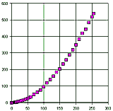
I took a series of photometer readings of a (supposedly calibrated) monitor's actual screen brightness versus the corresponding pixel values. (Yes, I admit to being that sad. I have no excuses)
This is what I saw after plotting the data in a spreadsheet.
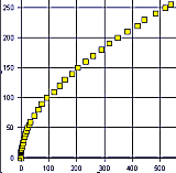
By transposing the axes of our monitor graph, we can come up with the inverse transfer characteristic that we need to apply.
"Inverse transfer characteristic!! Isn't that just a fancy way of saying curve?"
Why yes it is. Well spotted. And we can simply
use the curves function, either in MiraPhoto or Photoshop, to apply a close
approximation of what's needed to correct the monitor.
Like this:
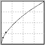 It's
not possible to get close enough by simply bending our straight line at
a single point though. If we do that, we can't get sufficient steepness
in the lower part of the curve before the highlights get saturated. We
need to grab at least two points on the curve to make it flexible enough
to do what we want.
It's
not possible to get close enough by simply bending our straight line at
a single point though. If we do that, we can't get sufficient steepness
in the lower part of the curve before the highlights get saturated. We
need to grab at least two points on the curve to make it flexible enough
to do what we want.
NOW do you see why I've been banging on about
using the curves tool, as opposed to using levels, or any of the other
tools? The curves tool is the only way to get the sort of correction
needed to compensate for the complex errors that have accumulated in our
image on its way to our screen.
I'd been applying this shape of curve to my scans for quite some time before I did this monitor characterisation, so it was good to see that the sort of correction I'd arrived at by trial and error was confirmed more scientifically.
(For the curious; the curve obtained from my
photometer readings tells me that my monitor has a gamma of 1.8)
Unfortunately, when the world of Television
collided with the world of still Photography, via computers, monitors,
scanners, and printers, the multiple different uses of the word "gamma"
sort of merged into a general term for image brightness, contrast, colour
balance, or anything else that was in need of a confusion inducing buzz-word
to describe it.
We really need to go back to basics to clarify
the situation.
In mathematics, the greek letter gamma is often
used to signify the slope of a curve, or more accurately, the rate of change
of slope of a curve. So, almost any parameter that can be described by
the use of a graph, can legitimately have the word "gamma" attached to
it.
Photographers use it to define the relationship
between exposure and image density of a film (as in the gamma settings
of MiraPhoto's 'FilmType.ini' file): Broadcast TV and computer monitor
engineers use it to describe the deviation from linearity of CRT brightness
with respect to input voltage; and Computer Graphics 'gurus' use it to
describe almost anything they don't understand properly; but in
computer terms, we should really try to confine the usage of the word gamma
to describing the non-linearity of a monitor.
Here are some useful links to explaining exactly what gamma means more fully:
The Gamma Correction Home page (recommended)
Monitor gamma explained The Gamma FAQ, by Charles Poynton
To some degree, most printers will need the
same kind of correction as a monitor, but there are no hard and fast rules.
Printers vary greatly from make to make, from
model to model, and with the type of paper that's used. Even the driver
version can have a big effect on the outcome. You'll have to find out for
yourself the best settings for your own printer.
All I can say is that with my particular printer
the image on paper is very similar to the image on screen, except that
the finished print shows a little more shadow detail and separation.
There's also a little phenomenon called "dot
gain" that makes defining printer characteristics a non too precise science.
Say we have an area of neutral grey that should
have 25% density. That is, it should be white paper with a quarter of its
surface covered with tiny little dots of black ink, giving the appearance
of a light to mid grey. Let's also say that the printer software calculates
that 50 tiny droplets of ink per square millimetre are required, based
on a drop of ink covering 1/200th of a square millimetre (a realistic figure,
by the way). Fine, if everything is the same as the test conditions that
the printer driver was designed under. But maybe the room temperature is
a few degrees cooler, and the paper used has a higher moisture content
than normal, or less binder than it should have. Those little drops of
ink are going to spread a bit more than they're supposed to before they
dry, covering 28 or even 30% of the surface of the paper, and instead of
25% density we've got nearer 30%, and our lightish grey becomes a definite
mid grey.
That's "dot gain", and why it's a bad thing
and not easy to regulate. What's worse, it can affect one colour of ink
more than another, so not only will the density be upset, but also the
colour balance.
The lesson to be learned from this is: Once you've got results from your printer that you're happy with, stick to the same brand of paper and ink, and don't go upgrading the driver every time a new version comes out.....Unless you want to start again from scratch, of course.
In the bad old days of wet processing, we were
pretty much stuck with what the film manufacturers could come up with in
the way of colour reproduction. Digital imaging has changed all that forever.
It's now possible to take almost any old film, scan it and manipulate it,
and give it almost any colour rendering we can dream of.
The downside of this is that reality often
falls quite a bit short of our dreams.
What I'm trying to say, is that although it's
now technically easy to achieve standards of colour reproduction that weren't
even possible just a few short years ago, we shouldn't fool ourselves that
perfection is within reach.
The film we use isn't perfect: Infrared and
Ultraviolet light make it 'see' colours that the eye doesn't: The spectral
sensitivity of film isn't perfect: The dyestuffs that are used in film
aren't perfect: Our scanner isn't perfect. But now, the unreachable carrot
of perfection is being dangled just that little bit closer in front of
us by digital imaging technology. We can change the hue, saturation, tonal
range, and colour balance almost to our hearts content. In fact we could
probably spend half a lifetime tweaking a single image to the point of
perfection. But let's keep our feet firmly planted on the ground. Let's
recognise that there really is no such thing as perfect colour, and know
when to call it a day.
Accurate colour, under all viewing conditions,
is just not possible. That green grass will be a bit yellower after a day
in the sunshine, and that plum brocade looks decidedly navy-blue next to
a hot-pink dress.
In reality, it's all just an approximation
of the real thing. Colours change depending on the light that they're viewed
in, and probably, depending on who does the viewing.
If you're forever chasing rainbows, then every other pot of gold may go unnoticed.
You are seeker after enlightenment
number
![]()